


Animated Arrow
Each text link will have an animated arrow hover effect.
Most of the time, the styling will remain the same.
However, there will be times where custom styling is needed on certain pages.
Place all the custom styling inside the <span> tag (Where it says “insert custom styling if needed”).
HTML:
<div class=”arrow-active”>
<strong>
<a href=”insert url here“>
<span style=”Insert custom styling if needed“> Insert text here <i class=”fa-solid fa-arrow-right arrow-short”></i>
</span>
</a>
</strong>
</div>
CSS:
This is a global code that is already set. You only need to insert the HTML with the class “arrow-active”.
.arrow-active: hover .fa-arrow-right: before {
content: “\f178”;
font-size: 15px;
font-weight: bold;
}
.fa-solid, .fa-arrow-right .arrow-short, .arrow-active {
font-size: 14px;
font-weight: bold;
}
Breadcrumbs
Pages with breadcrumbs will have this look and interactive changes.
Like a TAG text, the text will be all caps.
The text will change from black to Kotis orange without any underline.
Place the CSS in the page’s CSS and assign the div wrapping the breadcrumb the “sl-tag” class.
Font size should stay 20px and the “/” should be the same.
HTML:
<div class=”sl-tag”>
<a href=”insert url here“>
<span>SWAG </span>
</a>
<span> / </span>
<a href=”insert url here“>
<span> SWAGLAB</span>
</a>
</div>
CSS:
.sl-tag {
font-size: 20px;
font-weight: normal;
}
.sl-tag a {
color: black;
}
.sl-tag a:hover {
color: #ff4c00 !important;
}
Heading Sizes
H1 42px
H2 36px
H3 32px
H4 28px
H5 24px
H6 22px
Font Size - Body
Example:
All body paragraphs should be the same size throughout.
Like a TAG text, the text will be all caps.
Body font size should only be 16px.
Body text within the hero can be a bit larger but not larger than 18px.

Start the hat you’ve been dreaming about
Foamie pick
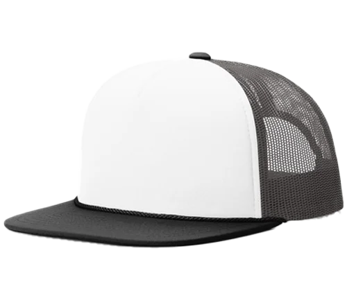
Richardson 113 Foamie Trucker
Classic trucker with a foamie front
A foam front and a flat bill give this hat a nice retro style.